A Problem That Sounds Simple
When someone buys a ticket at a live venue, a theater, a concert, a sporting event, they get a printed ticket at the door. The kind with their name, seat number, event details, a QR code, and a little tear-off stub on the right side.
Printing that ticket sounds simple. It isn't.
Our client, a live events ticketing platform, uses BOCA printers at their venues. BOCA is one of the most widely trusted brands in the live events industry. Walk into almost any major theater, arena, or sports venue in the US and there's a good chance a BOCA machine is handling their ticketing. They're fast, reliable, and built specifically for high-volume ticket printing.
But here's the thing: to tell a BOCA printer what to print and where to put it, you have to write instructions in a special language called FGL (Friendly Ghost Language).
FGL works like this: imagine the ticket is a blank grid. You have to tell the printer exactly where to place every single thing, the name, the price, the seat number, the QR code, everything, by giving it a row number and a column number. There is no drag and drop. No preview. You type a number, the printer prints it, and only then do you find out if it landed in the right place.
Get one number wrong and text overlaps, falls off the edge, or disappears entirely.
Our Biggest Problem: We Had No Printer
Our development team works remotely. We don't have a BOCA printer sitting in the office to test with.
So every time we needed to adjust the ticket layout, move the price a little to the right, make the event name bigger, fix the spacing before the QR code, our process looked like this:
- A developer writes the updated print instructions
- We send them to the client
- The client walks over to their printer room, prints a test ticket, and shares a photograph on Slack
- We look at the photo and try to figure out what needs to move
- We update the instructions and start over
One small layout change could take 30 to 45 minutes. And it often took 10 to 20 rounds of back and forth to get everything looking right.
It was slow, frustrating, and completely dependent on someone physically being at the printer.
What the Iterations Actually Looked Like
Here is the honest story, told through the photos the client sent us over several weeks.
Iteration 1: The "Receipt" Problem
Our very first print looked nothing like a ticket. It looked like a receipt.
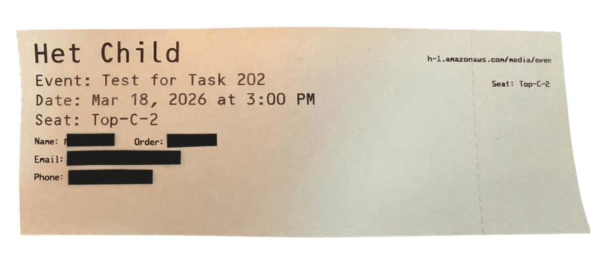
First iteration: receipt-style layout with no ticket structure
No header. No price area. No proper sections. Just raw data printed from top to bottom like a shopping bill. The client sent us this photo and we realised we hadn't even started solving the right problem yet.
Iteration 2: Everything Overlapping
Once we started writing proper FGL instructions, things got worse before they got better. Every element had its own coordinate, but we had no way to see where the coordinates actually landed, so elements were crashing into each other.
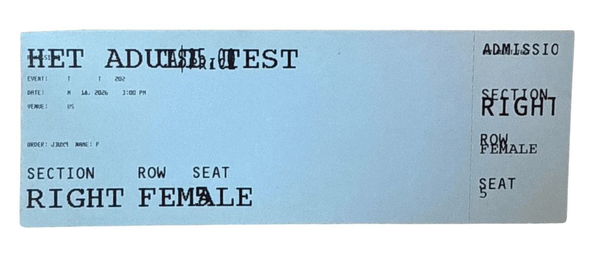
Second iteration: labels and values overlapping, text colliding
The ticket name, admission label, and price were all printing on top of each other in the top section. The stub on the right was barely readable. The client shared the photo on Slack and we updated the coordinates and sent a new version.
Iteration 3: Still Broken, Now With Two Tickets
We tried testing with two different ticket types at once to speed things up. Both were broken in the same ways, labels running into values, sections not aligned.
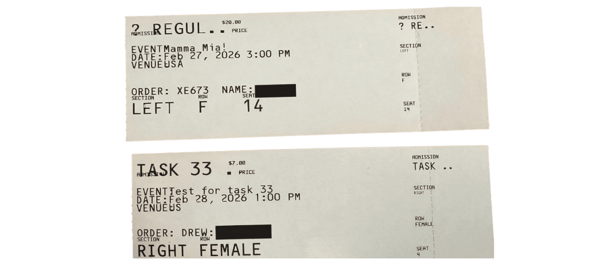
Two broken tickets showing overlapping layout issues
At this point we were starting to lose track of which coordinate change fixed which problem, because there was no record of what we had tried. Every iteration was a fresh guess.
Iteration 4: Structure Appears, But Multiple Problems Remain
After many rounds, the main body started taking shape, but looking at the printed ticket, we had several problems at once:
- The price was printing rotated 90 degrees on the right side of the ticket instead of at the top
- The ADMISSION label was overlapping with the ticket name in the header
- The EVENT, DATE, VENUE, ORDER, NAME labels were too close together with no breathing room between them
- The QR code area was missing, it had not printed at all
- The stub section labels were small and cramped
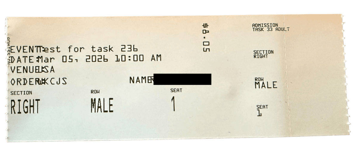
Progress on layout but price is printing vertically/sideways
Every one of these issues needed a separate coordinate fix. And since we could only see the result after printing, each fix was a separate round with the client.
Iteration 5: Finally on the Real Venue Ticket Stock
Up until now we had been testing on plain white paper stock. When we switched to the actual venue ticket stock, with the printed background colour and branding, new problems appeared. The left edge of the ticket was getting cut off.
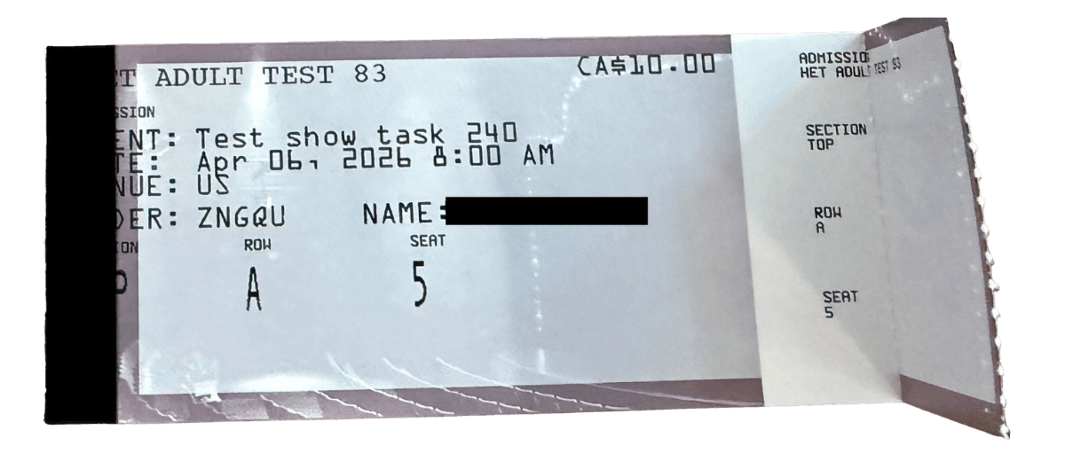
First print on real venue ticket stock: left margin cut off
The venue's ticket paper had a branded left strip (venue name, phone number, website) printed on it. Our layout coordinates assumed a clean white edge, and we had to account for this strip by shifting everything to the right. Another round of adjustments.
Iteration 6: Getting Closer
Same venue stock, next iteration. The layout was finally starting to look like a real ticket. The event block, order details, and seat section were all in the right zones.
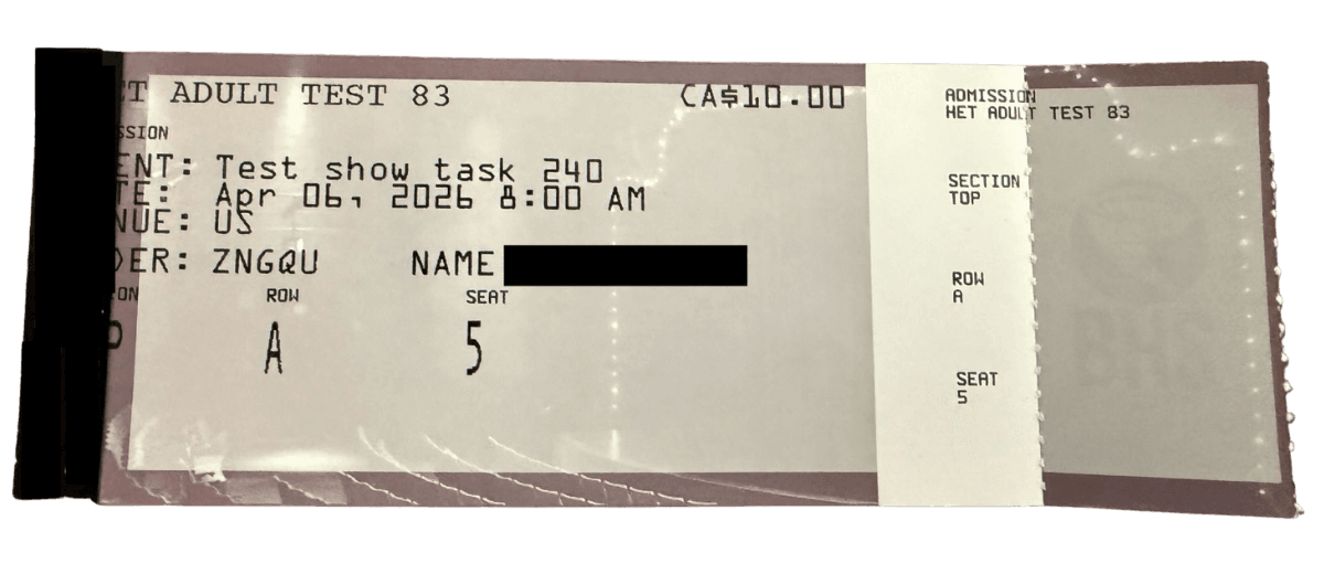
Cleaner layout on venue stock: EVENT/DATE/VENUE/ORDER/NAME/SECTION properly aligned
The stub on the right was also coming together, Section, Row, and Seat labels in the correct positions. But the label alignment was still slightly off and some fields were touching their borders.
Iteration 7: The Stub Finally Aligns
The client tore the stub off and shared both pieces. For the first time, the main ticket and the stub were both readable and correctly laid out, the divider line was in the right place, the stub content matched the main body, and nothing was cut off or overflowing.
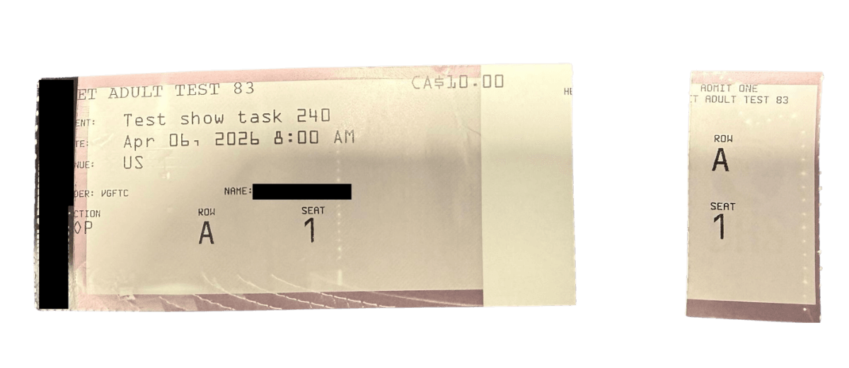
Ticket with stub torn off: both main body and stub look clean
This was the first time both halves looked correct, the layout was finally working end to end.
Iteration 8: QR Code Not Printing
The main body layout was looking cleaner, EVENT, DATE, VENUE, ORDER, NAME, SECTION, ROW, SEAT all in the right places. But two problems stood out:
- The QR code was not printing at all, a large empty white area sat where it should have been
- The stub was missing the SECTION field, only ROW and SEAT were showing on the tear-off side
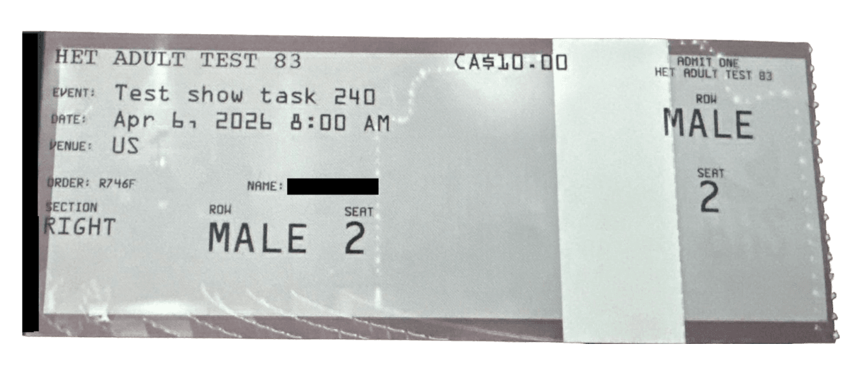
Layout clean but QR code missing, stub incomplete
The QR code issue turned out to be a command format mismatch, the FGL instruction was not being recognised by this printer's firmware version. Another update, another print request.
Iteration 9: QR Code Printing as Raw Text
The QR code was still not rendering correctly. Instead of printing an actual scannable QR code, the printer was outputting the raw URL as a long string of characters, printing across the entire ticket and overflowing off the edge.
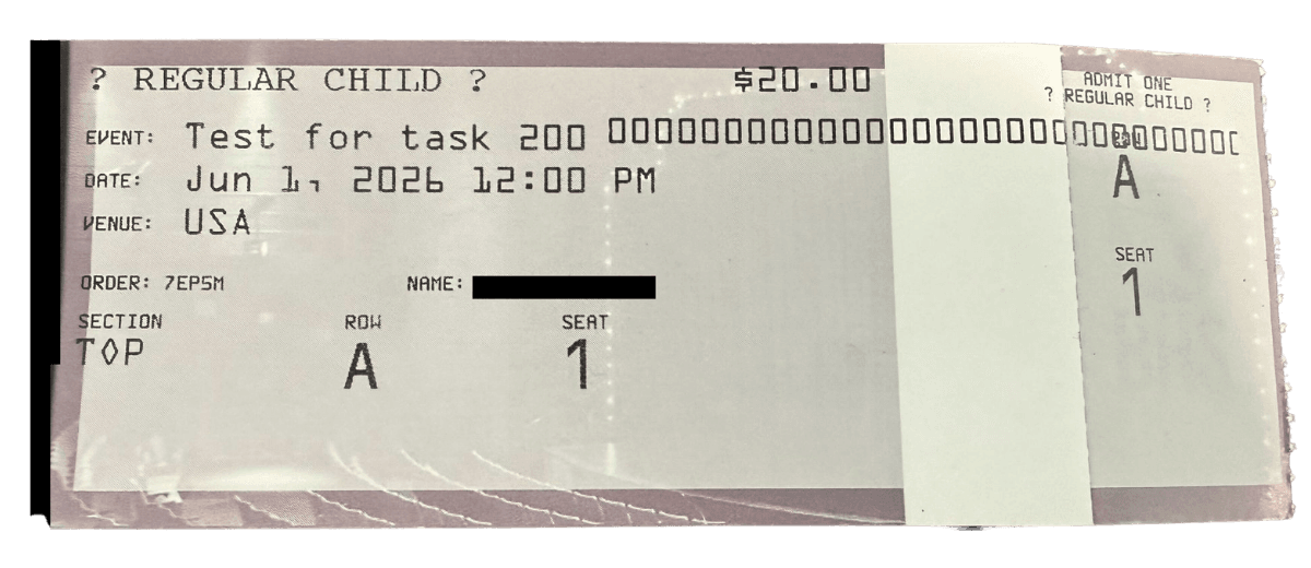
QR code URL printing as raw text instead of rendering as a QR code
This meant the FGL QR command format we were using was not supported by this printer's firmware. We had to switch to a different QR command syntax that the printer recognised and retest.
Still Not There Yet
After all those iterations, the layout had improved significantly, but it still wasn't matching what the client expected. The text was overlapping with the ticket's printed margin, the fonts were not the right weight, and the overall look was still far from the target.
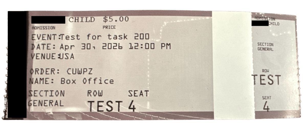
Latest iteration: still overlapping with margin, fonts and layout not matching expected
This is what the client actually wanted the ticket to look like:
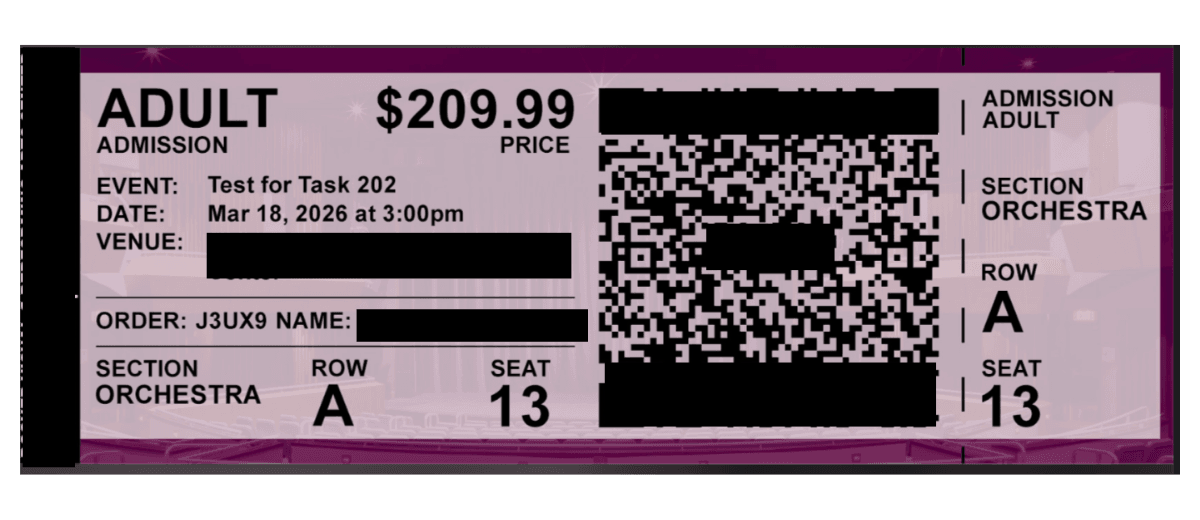
Expected ticket design shared by client: bold header, large QR code, clean stub with section, row and seat
A bold ADULT heading with the price on the right. A large scannable QR code. Clean EVENT / DATE / VENUE block. SECTION / ROW / SEAT clearly readable at the bottom. The stub matching perfectly on the right side.
The gap between where we were and where we needed to be was still significant, and every step still required a deployment, a print, a photo on Slack, and a round of guessing. This is exactly what pushed us to build the debugger tool.
The Real Problem
Every single coordinate change, no matter how small, required a full deployment. We would update the FGL command, deploy the code, message the client, wait for them to print, wait for the photo on Slack, and then start the whole cycle again for the next fix.
One pixel adjustment. Full deployment. Wait.
Move a label 5 dots to the right. Full deployment. Wait.
Fix the QR command. Full deployment. Wait.
There was no way to just try something and see it. Every guess had a cost attached to it, developer time, deployment time, and the client's time at the printer. We needed a way to iterate without deploying.
The Tool We Built
We built a browser-based BOCA ticket designer, a live visual playground that runs in any web browser, shows a real-size preview of the ticket, and lets you drag every element into position.
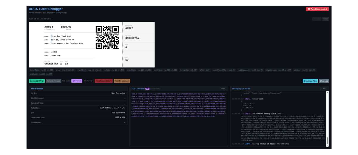
BOCA Ticket Debugger: live ticket preview, FGL command panel, and debug log
Instead of writing instructions and waiting to see what prints, you can now see the ticket on screen as you design it. The left panel shows the live ticket preview with draggable elements. The middle panel shows the FGL commands being generated in real time. The right panel is a debug log that records every action, print attempt, and error.
You See a Real-Size Ticket Preview
The tool shows a scaled-down replica of the actual BOCA ticket, the same proportions, the same layout zones, the same tear-off stub on the right. What you see on screen is what will come out of the printer.
You Drag Elements Into Place
Every part of the ticket is movable. Click and drag the ticket name, the price, the event block, the QR code, the seat information, anything. As you drag, the position updates in real time. No guessing. No waiting.
The Print Instructions Update Automatically
In the background, the tool is constantly generating the exact FGL print instructions based on where you've placed everything. The moment you finish designing, the instructions are ready, correct, precise, and ready to send to the printer.
You Can Undo Anything
Made a change you don't like? Hit Ctrl+Z. The tool keeps the last ten moves in history so you can experiment freely without fear of breaking the layout.
You Can Print Directly From the Browser
When connected to the printer (via a small program called QZ Tray), you can send the ticket directly from the browser to the BOCA printer. No exporting, no copy-pasting instructions into another system.
The Tool in Action: Client Prints It Themselves
Once we built the debugger, we shared it directly with the client. They opened it in the browser, used the default layout, and printed immediately, no deployment needed from our side.
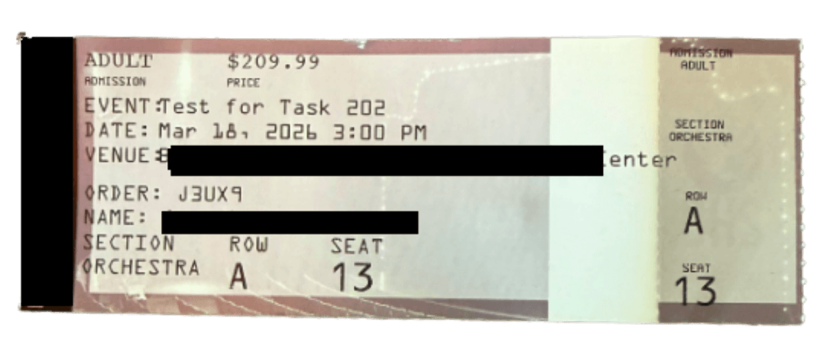
Client's first print using the debugger tool: layout correct but QR code still missing
The first print was already much closer. The layout, fonts, and structure were all correct. The QR code was still not showing, a known issue with the FGL command format for that specific printer firmware.
The client then adjusted a few positions themselves using the drag interface, corrected the QR command format, and printed again.
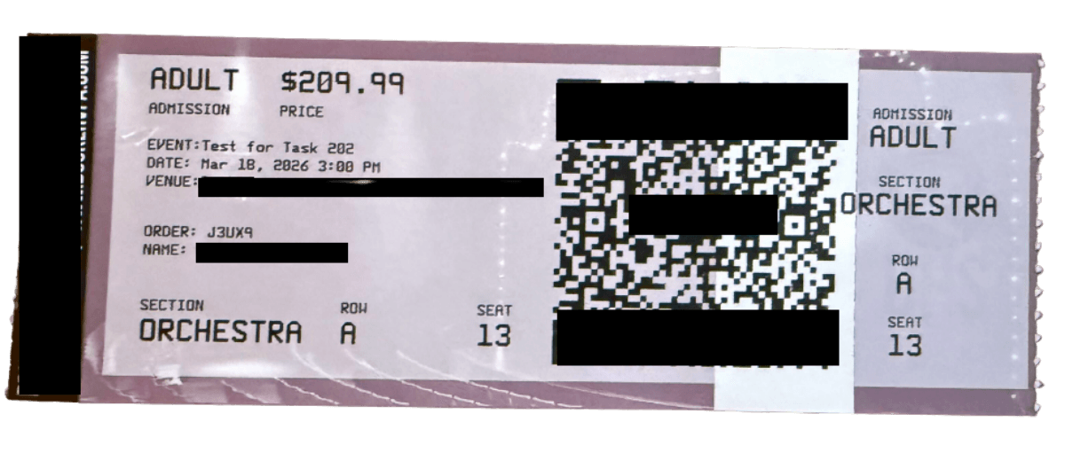
Final print: ADULT header, price, QR code, full event block, clean stub, exactly as expected
This was it. ADULT and $209.99 in the header. ADMISSION and PRICE labels. Full EVENT / DATE / VENUE block. A large scannable QR code. SECTION ORCHESTRA / ROW A / SEAT 13 at the bottom. The stub matches perfectly on the right.
No deployment from us. No back and forth on Slack. The client adjusted and printed it themselves.
Before and After
| Aspect |
Before |
After |
| Seeing what the ticket looks like |
Wait for a printed photo |
Instant preview in browser |
| Adjusting a position |
Edit code, redeploy, reprint |
Drag and drop |
| QR code size tuning |
Print multiple variants |
Drag the corner handle |
| Fixing long event name overflow |
Redeploy and ask client to reprint |
Visible and fixable immediately |
| Text overlapping issues |
Discovered only after printing |
Impossible, you see it live |
| Client involvement needed |
For every single change |
Only for final sign-off |
| Time per layout iteration |
30 to 45 minutes |
Under a minute |
| Time to complete a full layout |
2 to 3 days |
Under an hour |
The Bigger Lesson
We didn't build this because it was an interesting technical challenge. We built it because a painful, time-consuming process was getting in the way of doing good work for our clients.
The photos in this post are real. That was our actual workflow, Slack photos of tickets lying on a table, shared back and forth across time zones, trying to figure out if a number needed to go up by 5 or down by 10.
The best tools aren't always the most sophisticated ones. Sometimes the most valuable thing you can build is something that simply makes the invisible visible, so you can stop guessing and start knowing.
If your team is stuck in a loop of small changes, long feedback cycles, and "can you just print one more test?" That loop is worth breaking. The time you invest in fixing the process pays back every single day after.
The tool is open source, you can explore or adapt it here: github.com/Edugem-Technologies/boca-layout-designer